- Design
- Figma
Audit - Little Budget
- About
- Analysis
- Design Process
- UI design & Results
Introduction
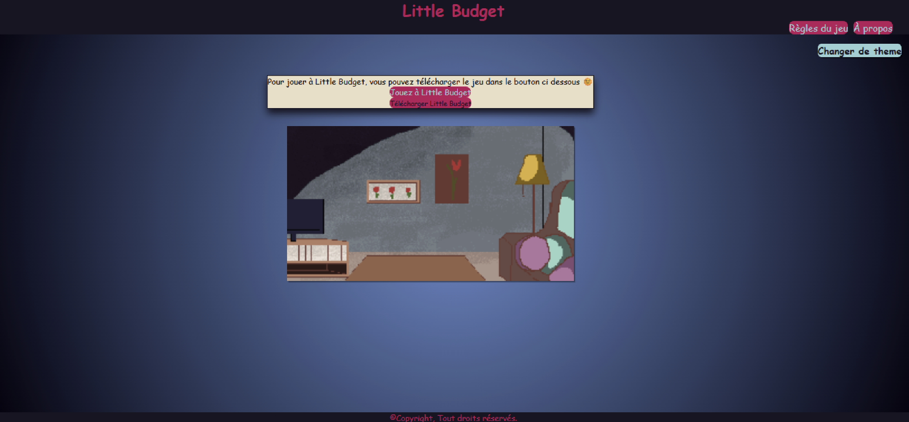
Little Budget is a project created during a 3-day finance-themed hackathon. It consists of a website and a game. The game contains a series of events that impact the player's budget based on their choices. The objective is to survive until the end without losing all your money
As UX/UI students at Interface3, my colleague and I audited this project's design and presented our recommendations to the entire school.
We had 3 days to analyse, create wireframes in figma, a pdf of our advice and prepare a presentation.
Before
After
- About
- Analysis
- Design Process
- UI design & Results
Analysis
Taking into account the user flow, we first did a list of the positive and problematic aspects in the website and game.
- Clarity of the user journey: Is it easy to understand what to do?
- Accessibility: Readability, contrast, intuitive navigation
- Consistency of interactions: Are the buttons, clicks, and transitions logical?
- Simplicity: Is it smooth or are there any friction points?
- Visual hierarchy: What catches the eye first?
- Readability: Text size, font choice, spacing
- Graphic consistency: Are the colors, style, and typography consistent?
- Emotional impact: Does the design make the tool appealing to users?
Then we divided them into 4 categories: Information organization, Colors, Buttons, UX writing.
- About
- Analysis
- Design Process
- UI design & Results
Design
Organisation
- Blank landing page
- CTA has the same style as the navigation buttons
- Multiple pages for additional information
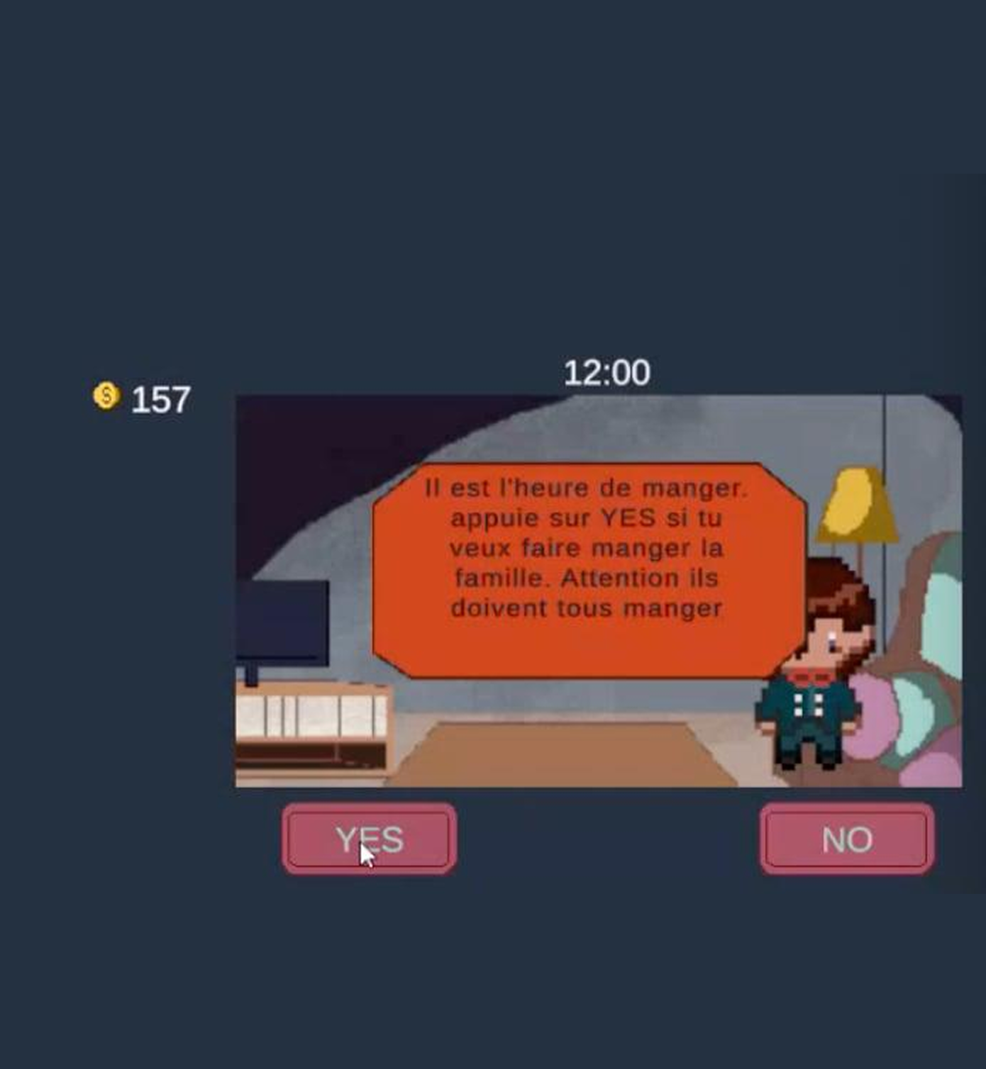
- No visual distinction between positive/negative events.
- Accessibility of color contrasts?
- Limited interactive feedback (hover)
- No current location indicator
- Limited clickable area size
- Generic CTAs ("Yes" / "No")
- Lack of precision regarding the impact of actions
Solution
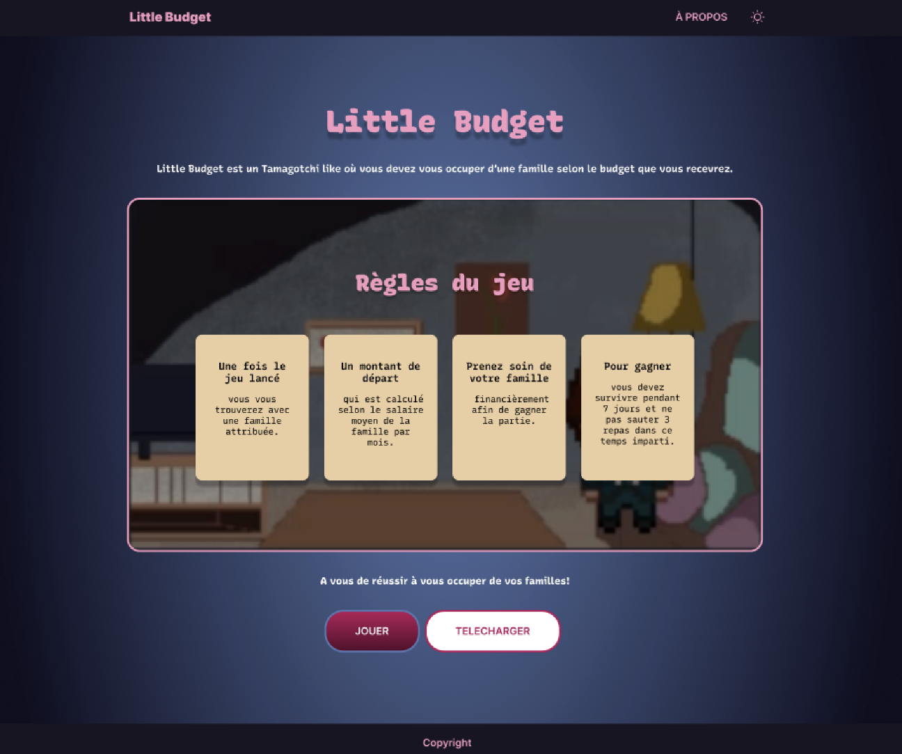
- Consolidate information into fewer pages
- Unify design styles
- Switch About page to vertical layout
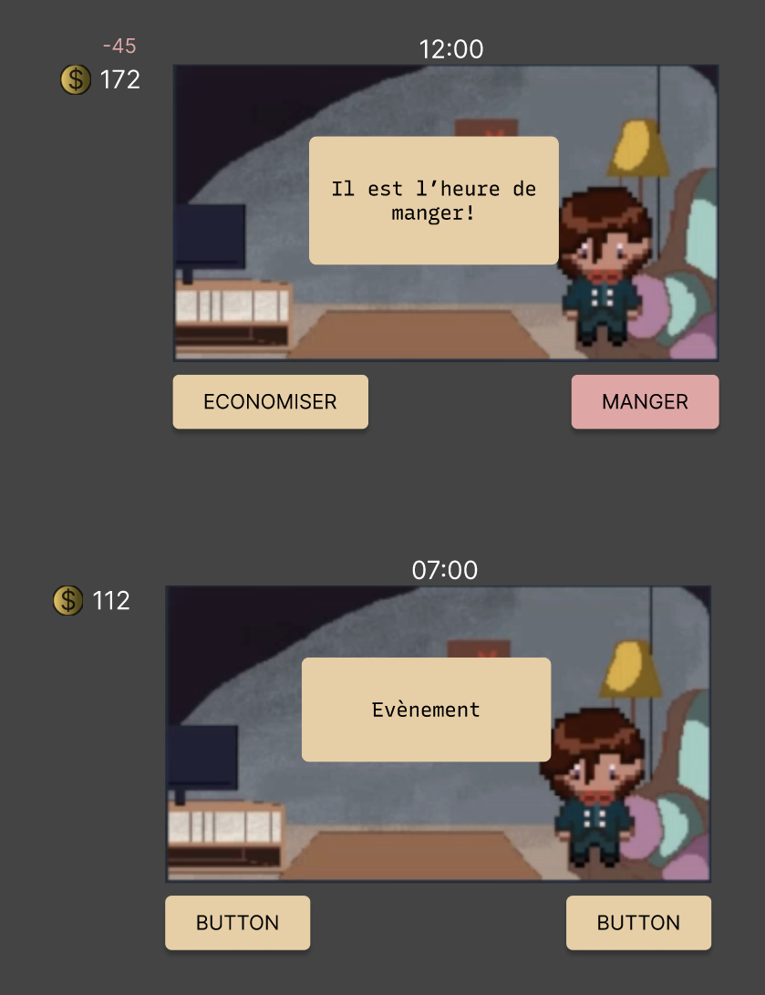
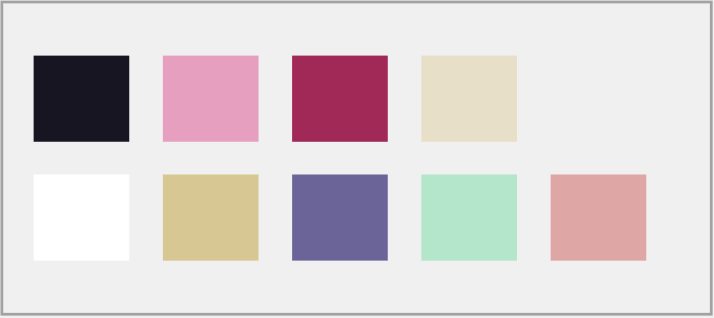
- Create a semantic color code.
- Use a Contrast Checker tool.
- Add hover states to show interactivity.
- Increase the clickable area for accessibility.
- Replace generic 'Yes/No' with action verbs
- Keep it concise (1 to 3 words)
- Explain the impact of decisions
Impact
- Reduced process steps & Reduced decision fatigue
- Faster decision-making
- Improved information retention
- Instant understanding of the consequences
- Reduced cognitive load
- Improved inclusivity (visual impairments)
- Users reassured about their location
- Improved predictability of interactions
- Increased click-through rate
- Improved accessibility
- Immediate understanding of the consequences
- More informed decision-making
- Increased engagement in the game
Result
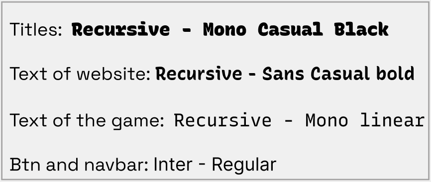
ToolBox
Aftermaths
Key learnings include:
• How to deliver constructive design feedback to cross-functional teams.
• Applying UX/UI best practices and accessibility standards in redesigns.
• Work with someone from a different background (she is a graphic designer and I have a frontend dev mind) in an international setting.